
Table of Contents
ToggleCabinet color dictates the entire mood of a kitchen, more than countertops, more than backsplash, more than flooring. It’s the largest unbroken visual field in the room, and changing it is one of the highest-impact renovations a homeowner can tackle. Whether painting existing cabinets or spec’ing new ones, the color decision affects resale value, perceived square footage, and daily enjoyment. This guide covers twelve proven palettes, from safe neutrals to head-turning statement hues, with practical advice on finishes, color matching, and how to avoid costly mistakes.
Key Takeaways
- Kitchen cabinet color dictates the entire mood of your space more than any other finish, occupying 30–40% of visible wall space and affecting resale value, perceived room size, and daily enjoyment.
- Timeless neutrals like white, greige, and soft gray are versatile and forgiving choices; test samples in multiple lighting conditions before committing to ensure the color doesn’t look muddy or cold in your specific kitchen.
- Bold kitchen cabinet color ideas like navy blue, forest green, and black create striking visual impact but require excellent surface preparation, proper lighting, and realistic expectations about maintenance demands.
- Two-tone cabinet layouts with darker lower cabinets and lighter upper cabinets create visual interest, ground the space, and make kitchens with standard ceilings feel taller without full commitment to a bold single color.
- Proper surface preparation—including degreasing, sanding, priming with a bonding primer, and applying thin topcoats—is critical for DIY cabinet painting success and prevents costly mistakes.
- Match cabinet colors to your kitchen’s style and layout: light neutrals for small galley kitchens and farmhouse aesthetics, high-contrast modern palettes for minimalist designs, and richer tones for traditional kitchens with detailed cabinetry.
Why Kitchen Cabinet Color Matters More Than You Think
Cabinets occupy 30 to 40 percent of visible wall space in most kitchens. That’s more real estate than paint, tile, or any other finish. The color you choose sets the baseline for every other design decision, hardware, lighting, appliance finish, even dish towel color.
From a resale perspective, cabinet color signals how current or dated a kitchen feels. Honey oak screams 1990s. Stark white can read cold or builder-grade if not balanced with texture. Mid-tone grays and warmer neutrals tend to photograph well and appeal to the broadest buyer pool, which matters if you’re planning to sell within five years.
Color also affects perceived room size. Lighter shades reflect more lumens and make compact galley kitchens feel larger. Darker tones absorb light but add gravitas in kitchens with ample natural light or high ceilings. If your kitchen lacks windows or relies on recessed LED retrofits, a deep navy or charcoal will demand significantly more artificial light to avoid a cave effect.
Timeless Neutrals That Never Go Out of Style
White remains the safest, most versatile choice. It pairs with every countertop material, from butcher block to quartz. For DIY painters, use a satin or semi-gloss finish in a 100% acrylic formula for durability and easy wipe-down. Pure whites like Benjamin Moore’s Simply White or Sherwin-Williams’ Pure White work in modern and traditional kitchens alike. Off-whites with warm undertones, think Alabaster or Swiss Coffee, soften the sterile hospital vibe and hide minor scuffs better.
Greige (gray-beige hybrids) hit peak popularity around 2020 and haven’t left. Colors like Agreeable Gray or Revere Pewter bridge the gap between cool and warm, making them adaptable to shifting décor trends. They’re forgiving with grout lines, stainless appliances, and mixed metallics. But, greige can look muddy in kitchens with poor natural light, test samples on at least two cabinet doors in different lighting conditions before committing.
Soft gray cabinets offer a contemporary feel without the starkness of white. Light grays like Stonington Gray or Classic Gray pair well with white subway tile and black hardware. Avoid blue-toned grays unless your kitchen gets strong southern exposure: northern light amplifies cool undertones and can make the space feel dreary. Always prime with a gray-tinted primer when painting over wood or previously stained cabinets to prevent bleed-through.
Bold and Dramatic Cabinet Colors for Statement Kitchens
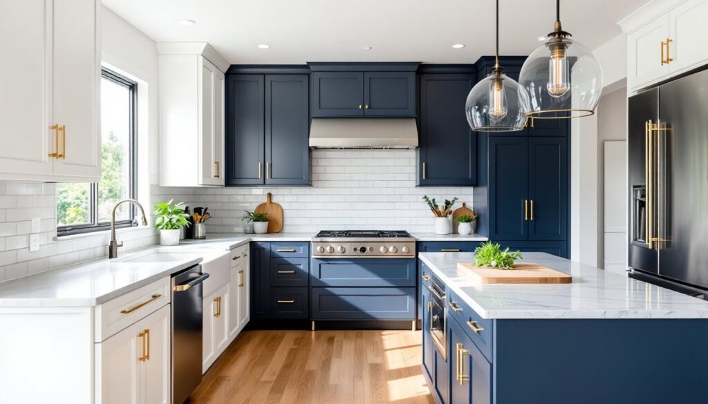
Navy blue delivers drama without the maintenance headaches of true black. It hides fingerprints better than lighter shades and pairs beautifully with brass or gold hardware. Naval by Sherwin-Williams and Hale Navy by Benjamin Moore are go-to choices. Use navy on lower cabinets in a two-tone layout to ground the space, or commit fully if you have at least 10 feet of linear cabinetry and strong pendant or under-cabinet lighting.
Forest green and deep emerald tones have surged in popularity as homeowners move away from gray fatigue. These hues work exceptionally well in kitchens with natural wood floors, white marble counters, or open shelving. Try Studio Green by Farrow & Ball or Jasper Green by Benjamin Moore. Dark greens require excellent surface prep, any sanding scratches or filler patches will telegraph through the finish. Plan on two coats of bonding primer and at least two topcoats.
Black cabinets are high-risk, high-reward. They look stunning in well-lit modern kitchens with white countertops and plenty of reflective surfaces, but they demand near-obsessive cleaning. Every water spot, grease splatter, and dust particle shows. If you’re set on black, use a matte or satin finish rather than high-gloss: it’s far more forgiving. Tricorn Black and Wrought Iron are popular, true-black options.
Two-Tone Cabinet Combinations That Create Visual Interest
Two-tone layouts break up visual monotony and let you test bolder colors without full commitment. The most common approach: darker lowers, lighter uppers. This grounds the room and makes upper cabinets recede, which can make a kitchen with 8-foot ceilings feel taller. Try navy or charcoal lowers with white or light gray uppers.
Another option: paint the island a contrasting color. A deep green or navy island anchors an open-plan kitchen and creates a natural focal point. Make sure the island color shares an undertone with the perimeter cabinets, warm with warm, cool with cool, or the contrast will feel jarring rather than intentional.
Natural wood uppers with painted lowers bring warmth without going full-retro. White oak, walnut, or maple uppers paired with white, sage, or soft blue lowers balance modern and organic aesthetics. This combo works especially well in kitchens with stainless or matte black appliances. If you’re refinishing existing wood cabinets, be aware that stripping old varnish is time-intensive and may require chemical strippers, a heat gun, or both. Ventilation and nitrile gloves are non-negotiable.
When planning a two-tone layout, many homeowners explore creative cabinet color ideas to find unexpected pairings that suit their home’s character.
Matching Cabinet Colors to Your Kitchen’s Style and Layout
Farmhouse and cottage kitchens favor soft, muted tones, off-white, cream, pale sage, or dusty blue. These styles lean heavily on texture: beadboard panels, shiplap, apron-front sinks. Cabinet color should complement, not compete. If you’re installing new shaker-style doors, a satin finish in Alabaster or Sea Salt keeps things light and approachable.
Modern and minimalist kitchens thrive on high contrast and clean lines. Flat-panel (slab) doors in true white, charcoal, or black create the sharp, uncluttered look these styles demand. Hardware is often hidden or minimal, consider touch-latch mechanisms or integrated pulls. If painting DIY, sand thoroughly between coats and use a foam roller to avoid brush marks on large, flat surfaces.
Traditional and transitional kitchens can handle richer, more complex colors, deep taupe, warm gray, or muted olive. Raised-panel doors have more surface detail, so color choice affects how much shadow and dimension the doors display. Lighter colors minimize the detail: darker tones accentuate it. If your cabinets have intricate molding or corbels, test your color on a sample door to see how it plays with the profile.
Galley and small kitchens benefit from light, reflective colors that maximize brightness. White, pale gray, or soft blush keep the space from feeling cramped. Avoid dark or heavily saturated colors unless you have exceptional lighting. Many small kitchen solutions emphasize light cabinetry paired with glass-front uppers to create visual depth.
Practical Tips for Choosing the Right Cabinet Color
Sample extensively before committing. Paint at least two cabinet doors or large poster boards and move them around the kitchen at different times of day. Morning light, afternoon sun, and evening artificial light all shift color temperature. What looks crisp at 10 a.m. might look dingy at 7 p.m. under warm LED bulbs.
Consider your countertops and backsplash. If you have busy granite or a bold tile backsplash, a neutral cabinet color prevents visual overload. Conversely, if your counters are simple white quartz or butcher block, you have more freedom to go bold with cabinets. Bring paint chips or sample jars to the stone yard or tile showroom, most lighting in those spaces is closer to what you’ll have at home than the paint store’s fluorescents.
Account for finish durability. Kitchens take abuse, grease, moisture, handprints. Semi-gloss and satin finishes are easier to clean than flat or matte, though matte hides imperfections better. If painting yourself, use a 100% acrylic alkyd enamel or a dedicated cabinet paint like Benjamin Moore Advance or Sherwin-Williams Emerald Urethane. These self-level better than standard wall paint and cure to a harder finish.
Don’t skip surface prep. This is where most DIY cabinet painting projects fail. Remove all doors and hardware. Clean with a degreaser like TSP substitute. Sand with 120- to 150-grit sandpaper to scuff the existing finish, then wipe with a tack cloth. Prime with a bonding primer, Zinsser B-I-N or KILZ Adhesion both work well on slick surfaces. Two thin coats of primer and two to three thin topcoats beat one thick coat every time.
Think about resale, but don’t be paralyzed by it. If you plan to stay in your home for more than five years, choose a color you love. Neutral cabinets appeal to buyers, but a well-executed bold color can be a selling point if the rest of the kitchen is cohesive and updated. On the other hand, if you’re flipping or selling within a year or two, stick with white, light gray, or greige to maximize appeal.
Conclusion
Choosing the right cabinet color is part art, part science, and entirely personal. Test samples in your actual lighting, match the tone to your kitchen’s layout and style, and don’t underestimate the power of good prep and quality paint. Whether going timeless white or statement navy, the color you choose will set the stage for every meal, conversation, and midnight snack for years to come.